Visualizations
Every chart in this project renders white-on-transparent, so it sits cleanly against this site's dark theme. Each one is available in a standard color palette or a diagnostic red-green mode built for at-a-glance health checks.
Chart Gallery
A sample of every chart and table type the engine currently produces.
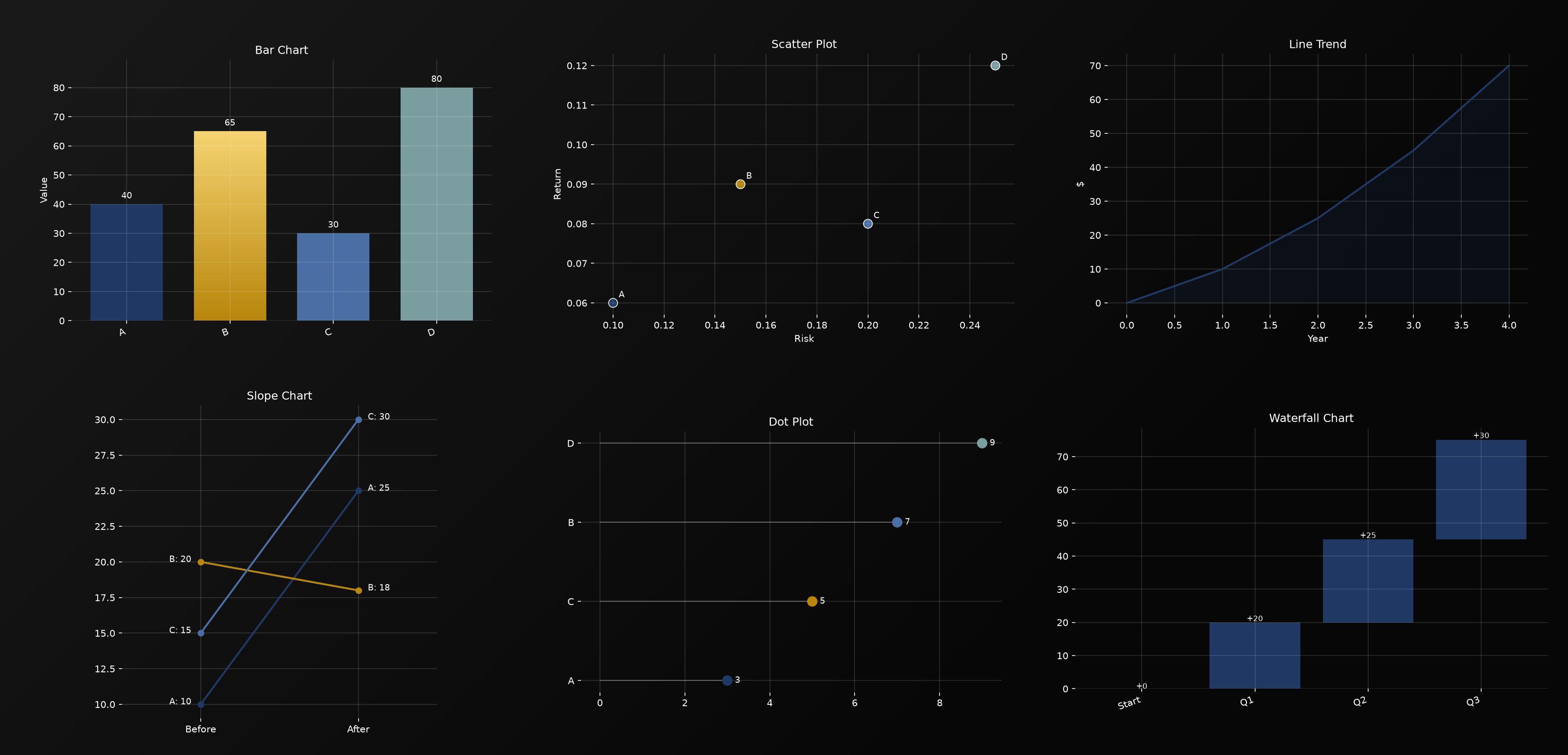
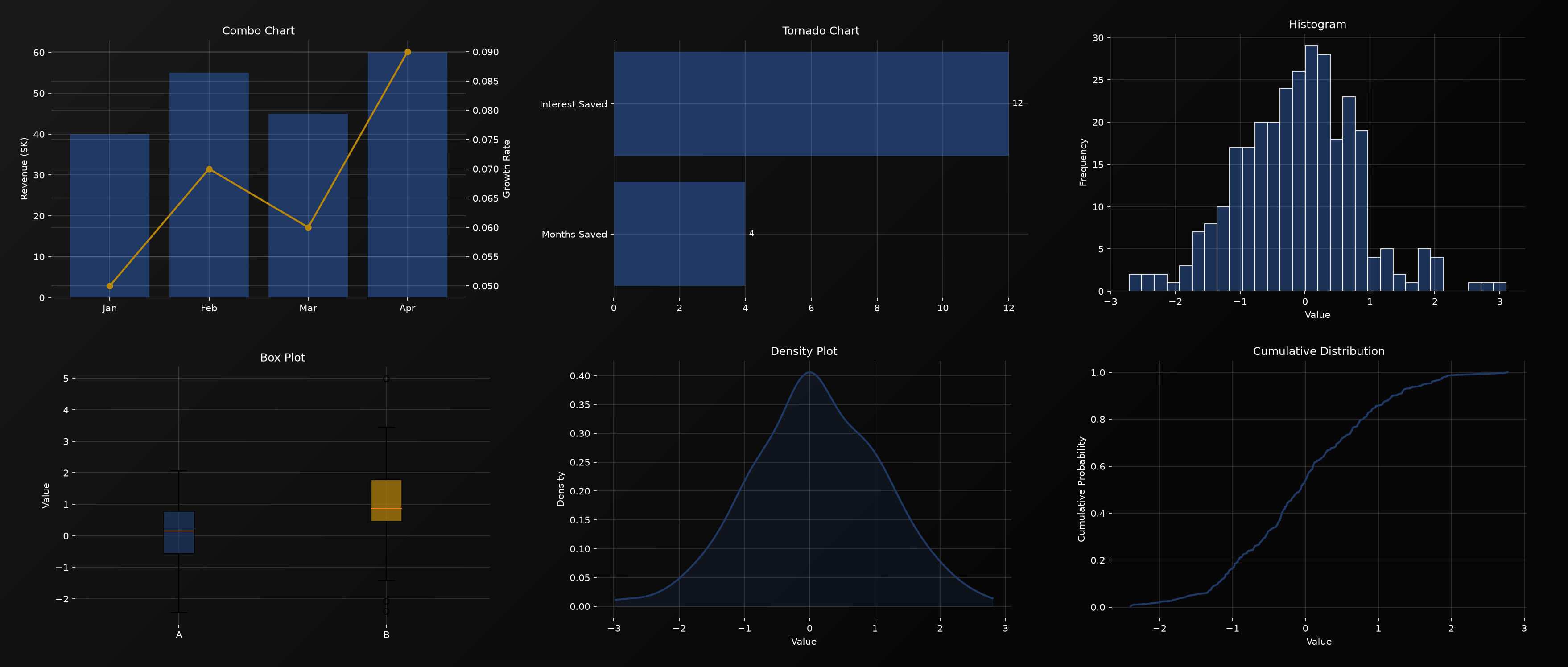
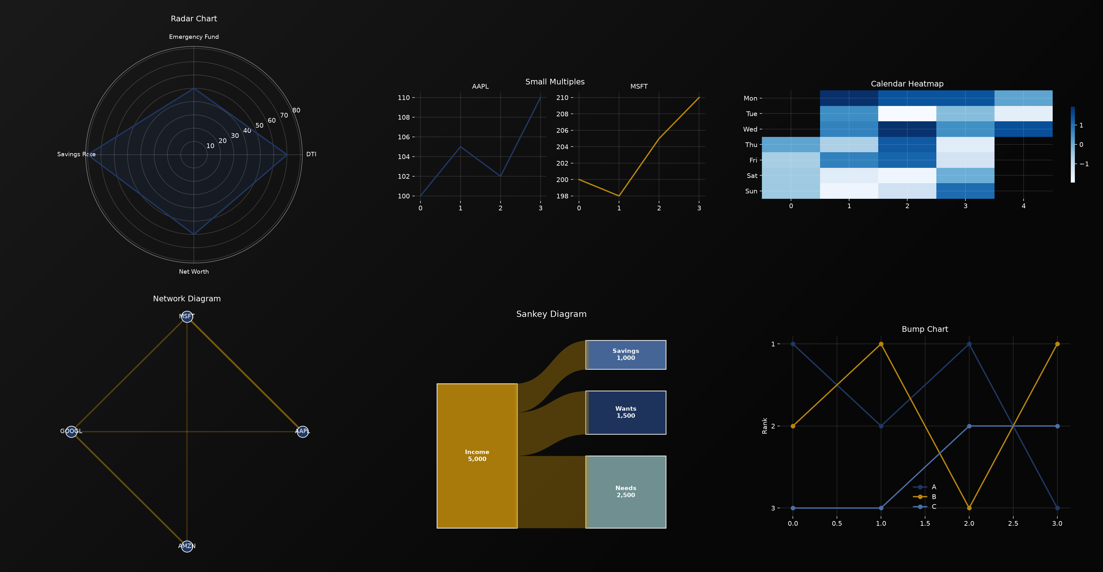
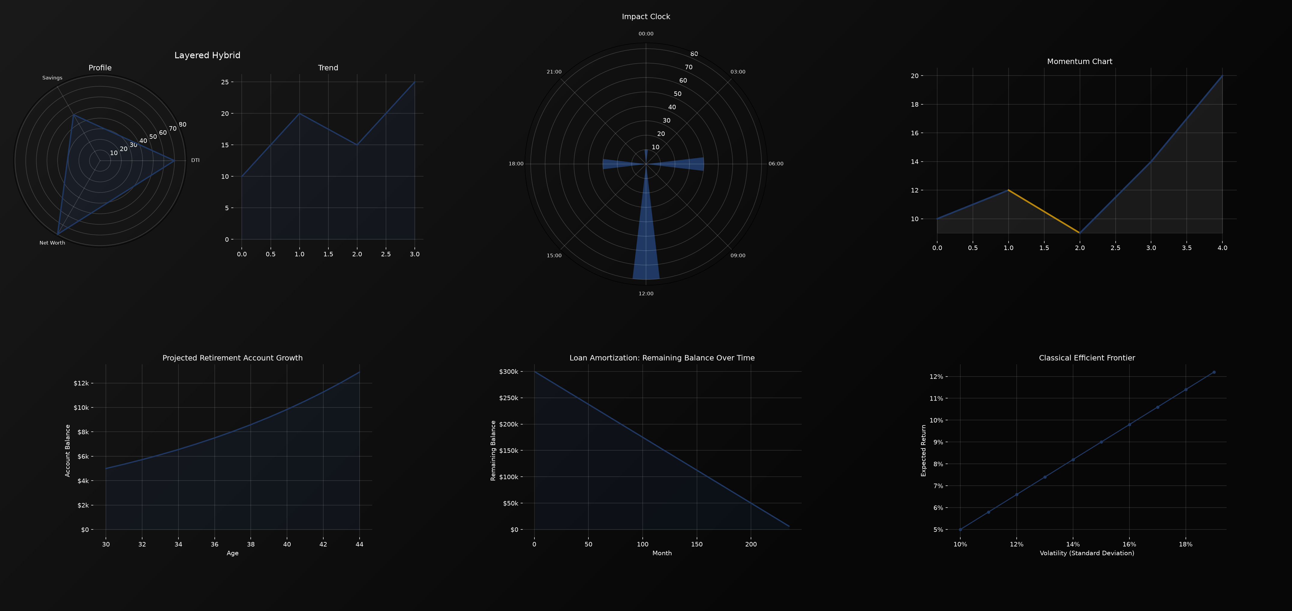
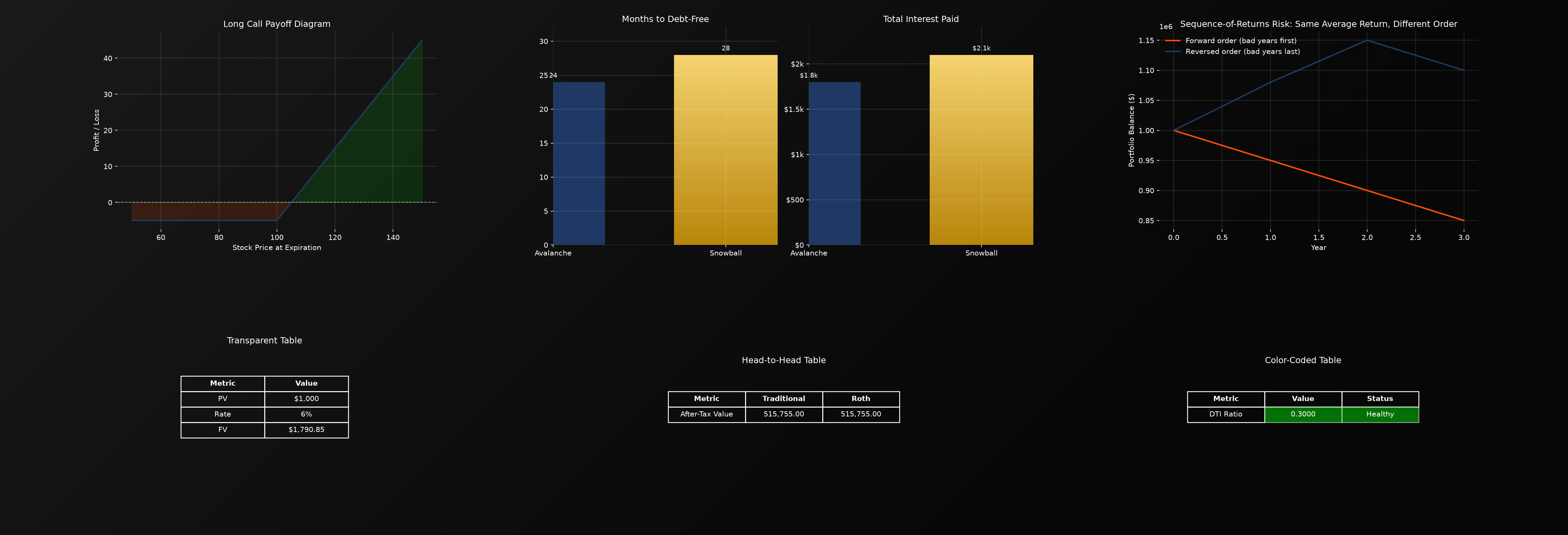
Chart types
- Bar, scatter, line/trend, slope, and dot plot charts
- Waterfall charts, useful for a budget or a DCF value bridge
- Combo charts, combining bars and a line on shared axes
- Tornado and diverging bar charts
- Histograms, box and violin plots, and density (KDE) plots
- Cumulative distribution plots
- Radar charts, including a diagnostic mode where each axis is colored individually by its own value, so a financial health scorecard reveals exactly which axis is weak at a glance
- Small multiples, a grid of mini charts, one per entity
- Calendar heat maps
- Network diagrams, for example a stock correlation network
- Sankey money-flow diagrams tracing income through taxes, needs, wants, and savings
- Bump charts, showing rank over time
- Layered hybrid charts, combining a radar view with a trend line
- Impact clock, mapping values onto a 24-hour clock face
- Momentum charts, where the trend line changes color on upward versus downward moves
When there is no natural chart
Some metrics, like a debt-to-income ratio or a single valuation multiple, do not have a natural chart shape. Rather than printing a bare number, these produce a clean, transparent, white-bordered table image, carrying the same visual polish as every chart in table form. Metrics with clear health thresholds, such as DTI, render with automatic green, yellow, or red status coloring.
The Visualization Studio
Rather than generating one chart at a time, the Visualization Studio produces every applicable visualization for a chosen metric at once, then allows you to:
- Save any individual visualization
- Combine every visualization for one metric into a single dashboard image
- Switch the entire set to red-green color coding without re-entering any numbers
- Build a custom cross-metric dashboard by selecting one visualization from each of several metrics in sequence
See it live in the interactive dashboard.